
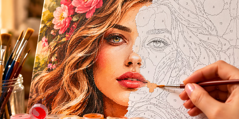
Custom Paint-by-Numbers Portraits: How to Achieve the Most Realistic Result
A portrait is the most demanding type of paint-by-numbers project. Unlike a landscape or a still life, even the slightest distortion of facial proportions or an incorrectly chosen skin tone is immediately noticeable. In this guide, we’ll break down how to choose the best photo, which generator settings to use, and what to keep in mind while painting to ensure your finished masterpiece truly resembles the original photo.
How to Choose a Photo for a Paint-by-Numbers Portrait
The final result is largely determined even before the photo enters the generator.
Lighting and Angle
- Even lighting from the front or side at a slight angle. Harsh side shadows (common in direct sunlight) create high-contrast dark spots on the pattern, which can easily be mistaken for actual facial features when painting.
- Straight-on or slight three-quarter view. Extreme angles (profiles, looking up from below) make it harder to maintain proportions—especially when using a limited color count.
- Avoid harsh glares on skin, glasses, or jewelry. Bright, overexposed spots will be turned into separate white zones by the generator, which may look out of place in the final painting.
Resolution and Sharpness
For a paint-by-numbers portrait, it is crucial that facial features—eyes, eyebrows, the lip line—are clearly visible. If the original image is blurry or low-resolution, the pattern will lose the very details responsible for a person’s likeness: fine transitions around the eyes and the natural symmetry of the features.
Background
A solid or slightly blurred background (bokeh) is the optimal choice. A complex background with many small details forces the generator to spend “attention” on secondary elements, which can result in a less detailed rendering of the face.
Generator Settings for an Accurate Portrait
A portrait is one case where default settings almost never produce the best result. Here is what to focus on in the generator:
- Color count — closer to the maximum (25-35+). Human skin consists of dozens of smooth color transitions—shadows, midtones, and highlights. A small number of colors (10-15) will flatten these transitions, making the face look “flat” and less recognizable.
- High detailing. Facial features are the fine elements that are the first to disappear with low detailing. For portraits, it is worth setting this parameter closer to the maximum value.
- Moderate smoothing. Excessive smoothing merges neighboring skin tones into one large zone, causing the loss of natural light and shadow transitions that create volume and likeness. For portraits, it’s better to keep this parameter at a low-to-medium level, even if the pattern ends up with many small zones.
After generating, compare the preview with these benchmarks: are the contours of the eyes, nose, and lips clearly readable? Do the eyebrows merge with the forehead skin into a single zone? Is the natural asymmetry of the face preserved? (Most people have it, and losing it is a common reason why a finished portrait “doesn’t look right”).
If the portrait looks too generalized after the first generation, increase the number of colors and detailing slightly and try again. The preview updates instantly, allowing you to quickly test several combinations to find the one where the face looks most accurate.
Selecting Skin Tones While Painting
Skin tone is the most visible part of a portrait, and this is where likeness is most often lost due to inaccurate color matching.
- If you don’t have the right skin tone in your paint set, use the PaintByNumbers color mixing tool: take the required color directly from your pattern’s palette (or enter its HEX code), and the service will calculate the exact mixing ratio from basic pigments.
- Shadows and highlights on the skin in a portrait pattern are usually separate numbered zones with a darker or lighter shade of the same color. It is important not to mix them up or “simplify” them by eye—these subtle shifts in tone are what create the face’s volume.
- Apply skin tones in two thin layers rather than one thick layer. This makes the boundaries between neighboring tonal zones softer and more natural, closer to real light transitions on a face.
The Best Order for Painting a Portrait
To maintain accuracy in the most critical areas:
- Start with the large background areas, clothing, and hair—errors here are less noticeable.
- Move on to the general skin tone—the large areas of the face without fine details.
- Finally, paint the eyes, eyebrows, and lip line—the smallest and most important zones for achieving a likeness. By this point, your hand will be more steady, and the larger completed areas won’t distract you from the precision needed for fine details.
Frequently Asked Questions
Why doesn’t the paint-by-numbers portrait look like me, even though the photo was sharp? The most common reason is an insufficient number of colors or too much smoothing in the generator settings. Facial details are lost before it becomes noticeable on the preview. Try regenerating with higher detailing and more colors.
How many colors are needed for a high-quality portrait? Generally, 25 or more. The more smooth skin transitions you need to convey, the more shades you should use.
Can I make a paint-by-numbers portrait from an old or low-quality photo? Yes, but the result will be less detailed. The generator cannot restore features that aren’t visible in the original image. For the best result, choose the sharpest and best-lit photo possible.
How do I get an exact skin tone if it’s not in my paint set? Use the paint mixing tool—by HEX code or directly from the pattern palette, it will calculate the mixing ratio for the desired shade using basic pigments.